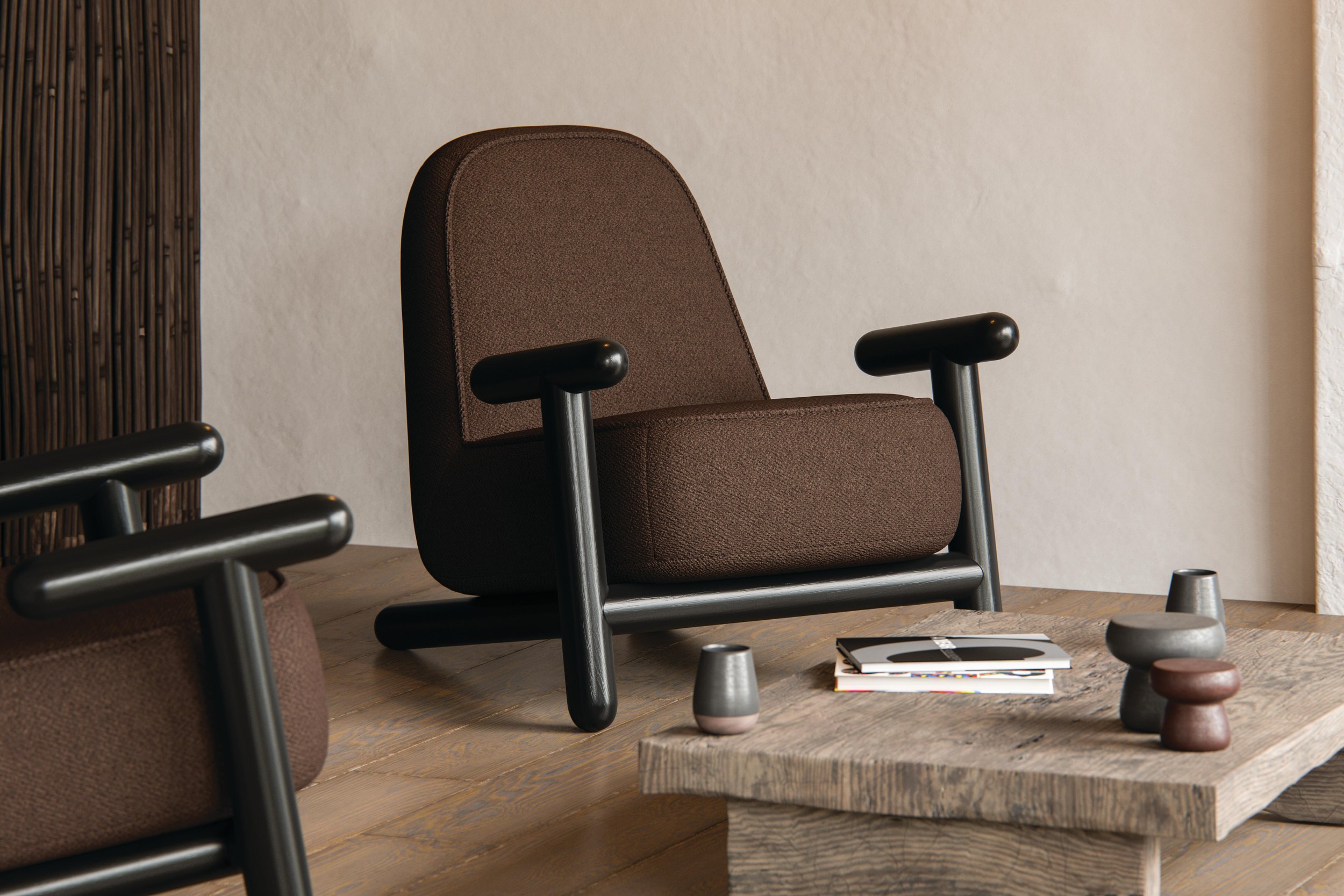
Chocolate is the new black
We share our tips on how to make the most of this trending colour.
A colour trend that started in fashion is now also popular in interior design. Rich, comforting, warmer than grey but less harsh than black, brown is proving why it’s the neutral shade to love. Some might call this brown’s renaissance but, in truth, the colour never really went out of style. It’s long been a staple of chic interiors for those creating moody yet elegant spaces.
Brown is far from boring. It represents the earth and nature. It is a robust colour signifying stability, protection, and maturity, according to colour psychology. It’s also a neutral shade that pairs well with every colour and remains timeless. Whether your preference is contemporary design with clean lines and a minimalist aesthetic or traditional with layers of detail, brown works across all styles.
Let’s explore how this hue can be used in home decor to incorporate the trend and maintain great style.
Chocolate colour combinations
Brown has many tones and shades that offer variety in combinations with other colours. A monochromatic palette with shades of camel, chocolate and cafe au lait is instantly soothing and relaxing. But, you can also use these colour combinations:
Brown and white, in any shade
Chocolate brown, cream and orange
Navy blue, beige and metallic or copper shades of brown
Warm tones of brown with purple and gold
Mahogany and jewel tones such as peridot, amethyst, ruby and sapphire
Warm minimalism
Minimalism can sometimes have a bad reputation for being a little cold and stark. This is also because people tend to associate minimalism with everything being all-white. Well, times have changed and so has minimalism. The style is all about “less is more” and focuses on having only what is needed to perform key functions but that doesn’t mean colour must be excluded. Brown brings in warmth and shifts the feeling from stark to solace. Within a neutral colour palette, there are various shades of brown that can work together to layer the look and achieve a form of warm minimalism.
Make a statement
For some people, a lot of brown can be daunting but they also don’t want to be overwhelmed by colour. While we are familiar with a statement piece or accent in a bright, vibrant colour, don’t discount brown as an eye-catching colour. A beautiful chocolate colour wall looks luxurious and the ante can be upped with a sumptuous wall covering. Accent cushions or an ottoman in a magnificent fabric add that premium look. And don’t forget there’s a reason why brown sofas haven’t gone out of fashion - the trick lies in the choice of fabric and the particular shade of brown.
For large pieces of furniture such as sofas or armchairs, a strong, timeless tone of brown will ensure the piece can transition through many decor changes because it remains neutral. From cafe noir to caramel to chestnut and tawny, the choice of colour and upholstery can determine if a statement piece reads as familiar and inviting or lush and inspiring.
Don’t forget the texture
Because of its great variation in tonality, one way to make the most of brown is to play with texture. The shame shade can look different simply because it’s either 2D in a flat, woven fabric or 3D in a raised texture. Texture can also elevate the depth or light within the shade of brown, from a chic taupe to rich dark chocolate. Coffee or cinnamon tones do well in textured fabrics and they are a fun way to add visual interest to a scheme.
Bringing brown into the modern era
While the 70s made brown a star of popular interior design, it was also overdone. What one can do is take inspiration from those vintage looks and bring them right into the 21st century by pairing it with light white or cream colours or playing with colours such as burnished orange or shades of blue. Shapes and lines also influence how brown is perceived within a design but it is very adaptable.
“Brown is also a great foundation for people who find themselves stuck between traditional and contemporary design styles. As hybrid styles continue to grow in popularity, brown proves to be a far more sustainable and amenable neutral upon which to build a design scheme rather than black or grey simply because it is likely to age better and be easier to adapt to a new look. ”
Home Fabrics has a wide selection of fabric and wallcoverings that will ensure your chocolate colour scheme will be delicious. For the latest, on-trend products, visit our showrooms or have a look through our collection galleries or Pinterest boards for inspiration.


